You have to pick a font to write anything. Be it your handwriting, homemade holes in stencil cardboard, pixel art, or a digital font.
This fact is obvious; it has been in front of you all this time, since you learned to read, and you probably never noticed it. Maybe you see it now. You notice the thickness of the lines, their geometry, the absence or presence of serifs1. Perhaps you will realize this for a few minutes, followed by sparse moments of clarity for a few days at most; maybe you’ll remember one more time in a few months.
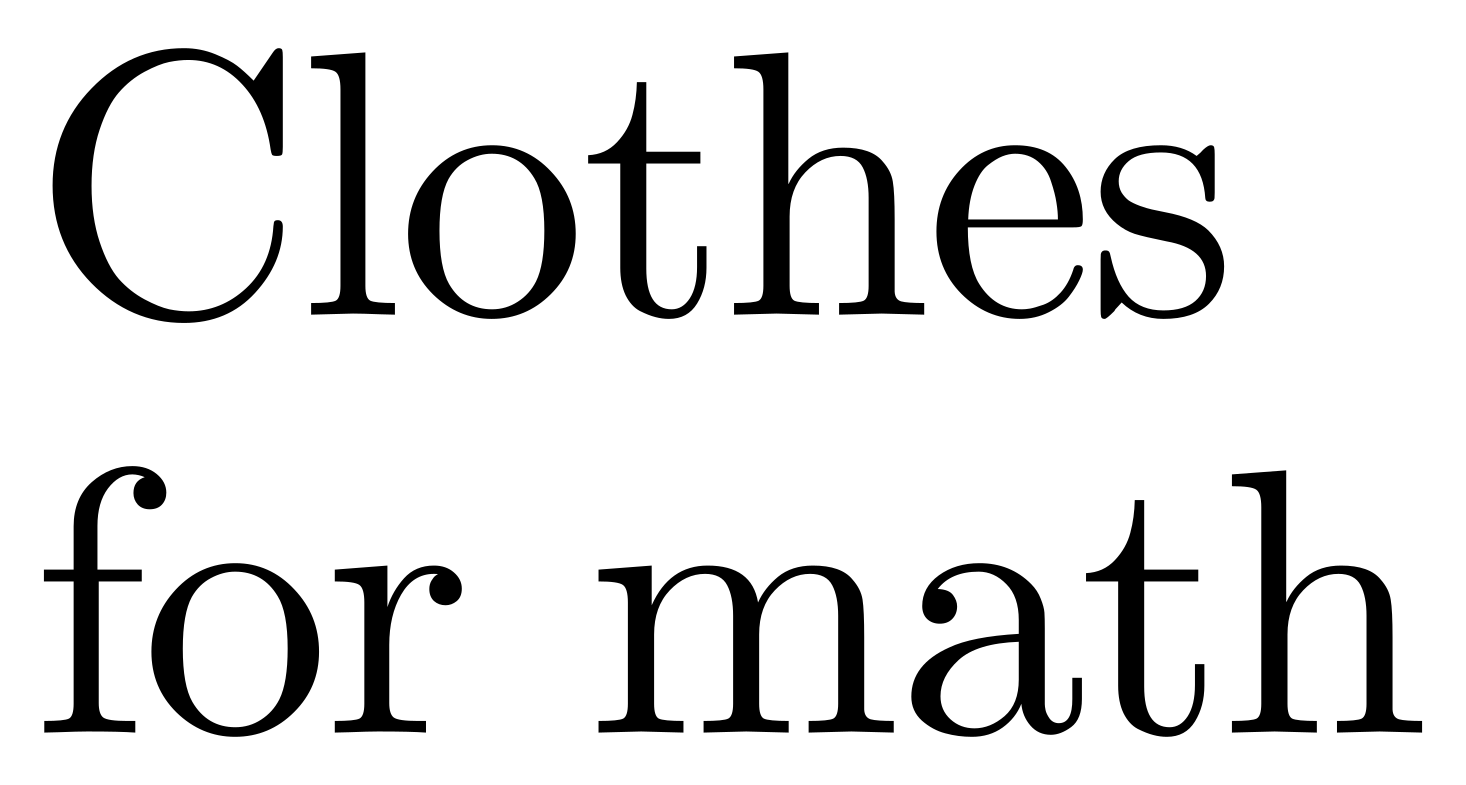
For most of your reading moments on this planet, you will likely not notice the font you read. You will notice the content of the text, but never its clothes. You might read a book cover to cover, even carefully remembering its ISBN, and you’ll think you read it all. But did you read the font?
Type designers and typographers2, they read the font. They mastered the use of this direct unconscious access to your brain. It’s as if they can compose playlists that you will listen to for hours a day, for the rest of your life.
They are visual alchemists. They possess an intuitive knowledge of deep parts of our psychology. They know how to craft abstract black-and-white patterns to make us feel a certain way. The precision of their craft is mind-boggling; a hundredth of a percent off can throw a letter out of balance. They play with our edge detection algorithms, our perceptions of filled and empty areas, how the middles of lines feel thinner than the edges, with abstract idea association like bouba-kiki, and also cultural motifs, how handwritten text feels romantic, for instance.
They know facts that neurologists, cognitive scientists, and Gestalt theorists will never put into papers. They’ve known for decades, for centuries.
Appreciation for specific designs
Here are some of my favorite typefaces. Note that a typeface like “Arial” is implemented in a collection of fonts, like “Arial Bold 12pt”. It is annoying how the technical term conflicts with the way 99% of people use the word “font”. But this is another story, as this post is not a rant, but an appreciation!
Computer Modern by Donal Knuth
In the process of writing his (ongoing) series of textbooks The Art of Computer Programming, Donald Knuth got frustrated by the digital tools for book creation available when he started the series, in the 70s. As side quests to writing what became the Bible of algorithm design, he created:
- \(\TeX\), a typesetting program to precisely compose documents from a series of commands. It is now mostly used as \(\LaTeX\), a language that provides more user-friendly commands that are expanded in \(\TeX\) at run time, and uses the same rendering engine.
- METAFONT, a descriptive language to design fonts as a set of mathematical equations, the same name is also used to refer to the software rendering the fonts into pixels.
- A five-volume series of documentations Computers & Typesetting Series containing the manuals to compose documents in \(\TeX\) and modify or create fonts from scratch using METAFONT, as well as a comprehensive introduction to typesetting and digital typography.
… and Computer Modern, a font family (or typeface) designed using METAFONT. It became the default font for any document produced using \(\TeX\), and now shapes the aesthestics of a large part of the scientific litterature. Computer Modern is not a simple collection of different styles, like bold, italic, light, extra-bold, etc. It is meta-font, an infinite space of fonts defined programatically by 60 parameters. Specific values of these parameters have been picked to become the 17 styles of the canonical release “Computer Modern Unicode (CMU)”, like the serif normal style shown in the image.
The breadth and depth of Knuth’s craft have been a north star for me – this is how far “caring about your work” can go.
The concept of meta-font has been implemented in the OpenType version 1.8 with variable fonts. Variable fonts are a specific kind of meta-font made from interpolations between master font designs.
Pimpit by Benoît Bodhuin.
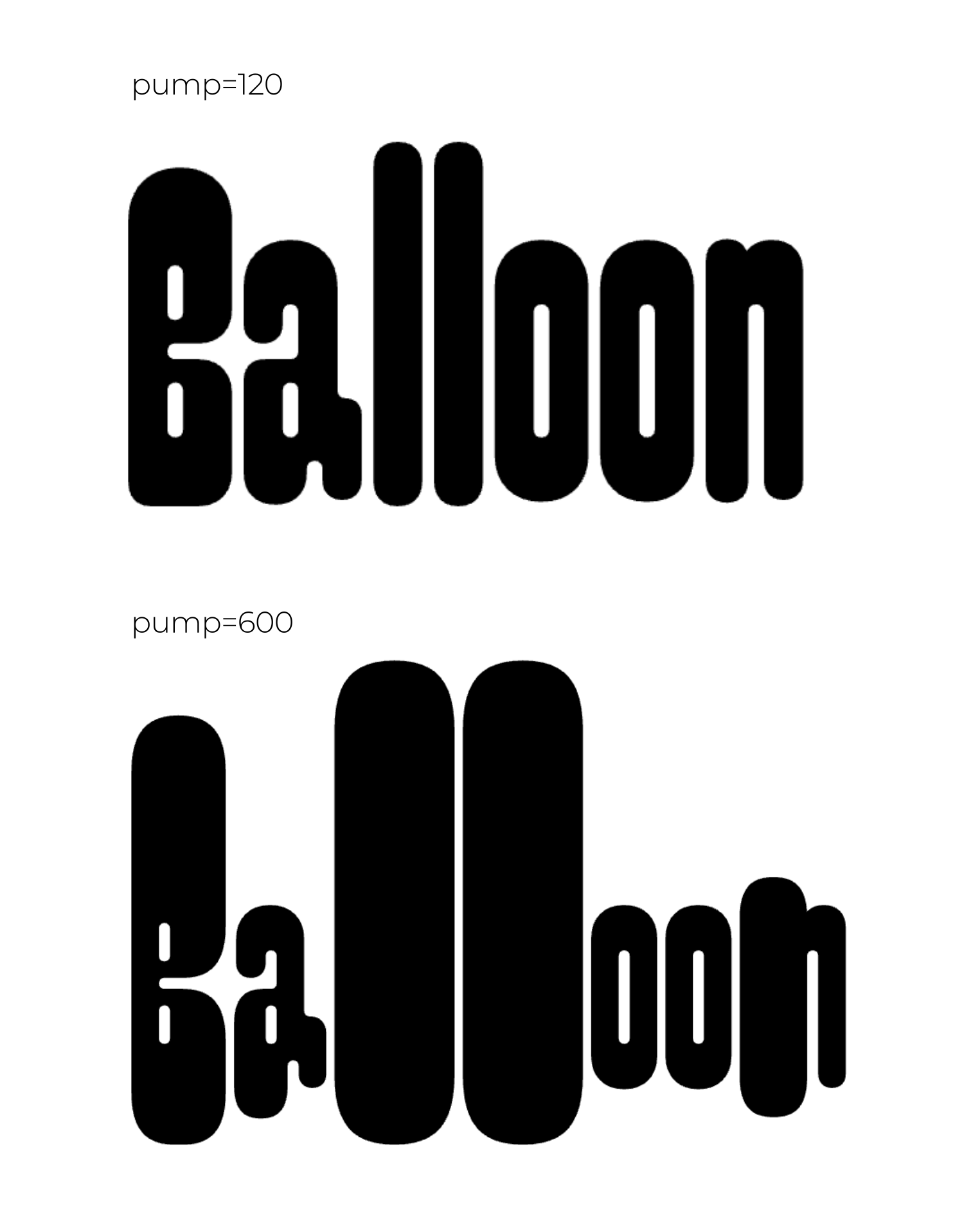
Most variable fonts have classic (boring) parameters like “weight” or “letter width” that you can continuously vary. For pimpit, Benoît Bodhuin introduced the fun “pump” parameter that inflates some parts of the letters.
Liza Pro Display by the Underware studio.
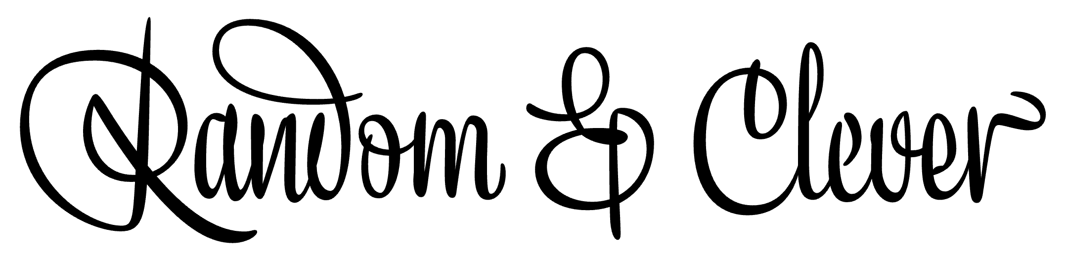
This font’s genius is in its code as much as in its visuals.
The creators took 5 years to create a font that feels handwritten. They started by designing multiple versions of the same glyph. Then, to choose which glyph version is displayed where, they implemented several clever rules to avoid repeats (see how the two “e” of “clever” are different). They calibrated the different uppercase variations according to their frequency of appearance and the “eye impact factor” of the design to avoid having one letter grabbing all the attention.
Some would say they went too far. What I know is that I appreciate the result.
You can read the story of the font here.
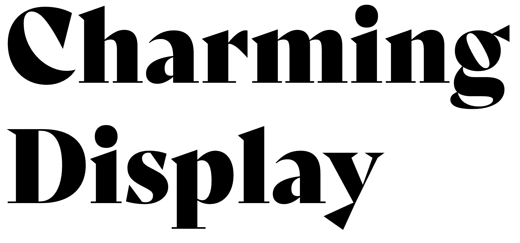
Copper black by Oswald Bruce Cooper.
This typeface comes from the 20s, from the time of newspaper advertising and irregular, cheap, high-volume printing techniques. You can’t tell the letters are not aligned when the font itself is wobbly! It also shows that, yes, you can fill this tiny surface with this much ink while maintaining excellent readability.
Bely by Roxane Gataud.
This font is so flashy that when I discovered it in a magazine, I stopped reading and marveled at the balance between its thick and thin parts. I mean, look at these curves!
-
Serifs are little slabs at the end of the letter strokes. Sans serif, or sometimes simply Sans means the font doesn’t have the slabs. ↩
-
Typographers are arranging the text for its display, making decisions on the position, weight, spacing, etc. Typographers work with typefaces (e.g. “Arial”) implemented in fonts (e.g. “Arial Bold 12pt”) created by type designers. ↩
Want to hear when I post something new?